Tiptoh
2021 — present
brand identity
packaging
web design
Copywriting by goodcopy.ink
Packshots by French Beans
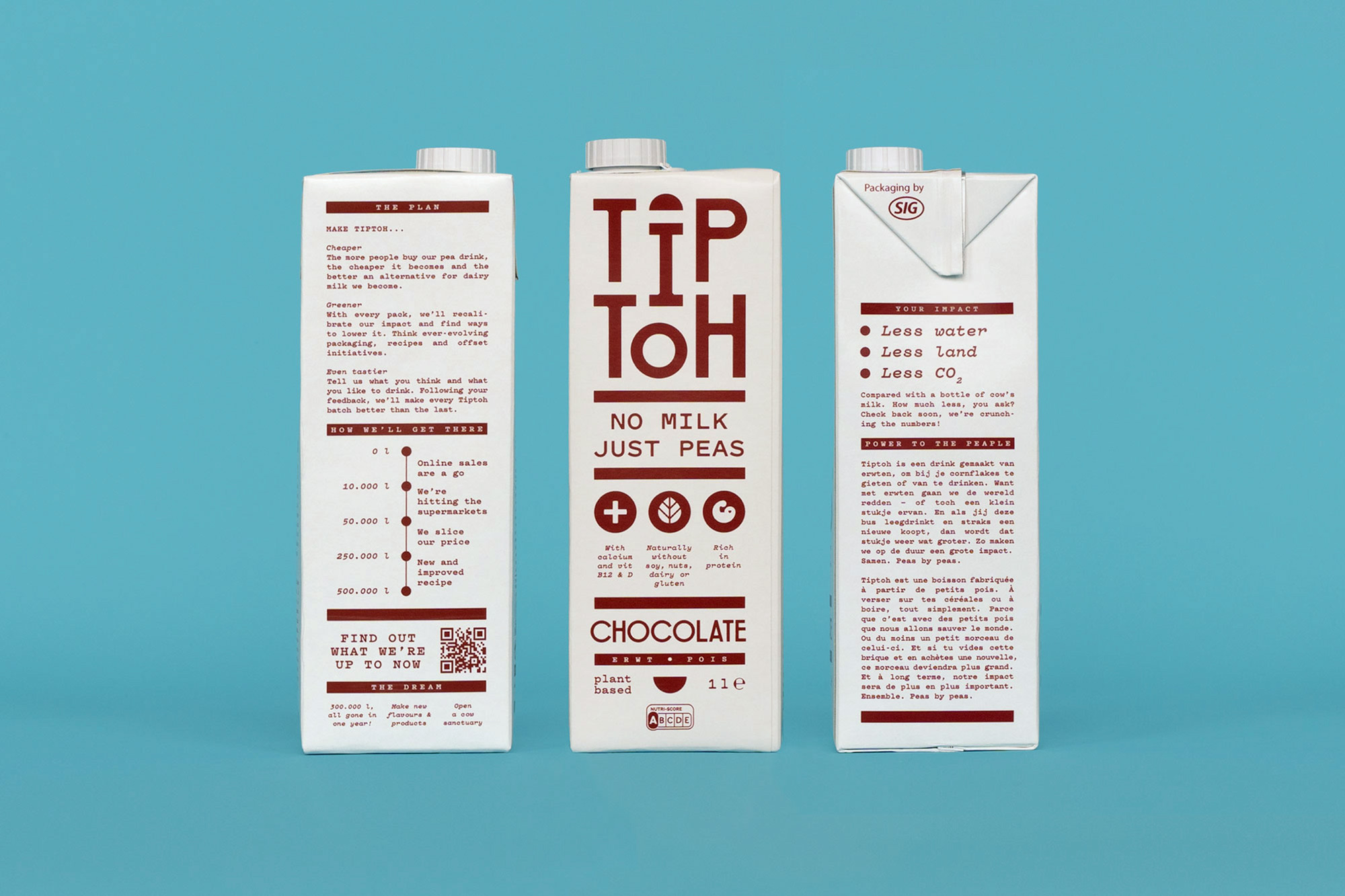
Tiptoh is a brand new and innovative plant-based drink made from split peas. Its visual identity is defined by a stacked wordmark in which the split pea, the core ingredient of the product, is implemented in an abstract way. Secondary information extends this vertical, stacked design through the consistent use of graphic bars and geometric pea shapes.
I chose the characteristic yellow color of the pea as the foundational base for the new identity and its first product: the Original. To build a cohesive family, each subsequent product in the Tiptoh range was given its own distinct spot color, combined solely with the clean white base of the packaging. This approach creates a striking, color-coded series designed to attract maximum attention on busy store shelves. One of the challenges we tackled was Tiptoh’s ambition to communicate as transparently as possible. To achieve this, I featured their road-to-market story prominently on every package.
Recently, Tiptoh introduced its newest product, the Barista, developing two distinct versions: one made with Pea milk and, for the first time, one made with Oat milk. With a dedicated focus on specialty coffee shops, I gave the packaging design a fresh update, adding a clear naming system, abstract imagery, and quirky illustrations to the sleek graphic style.
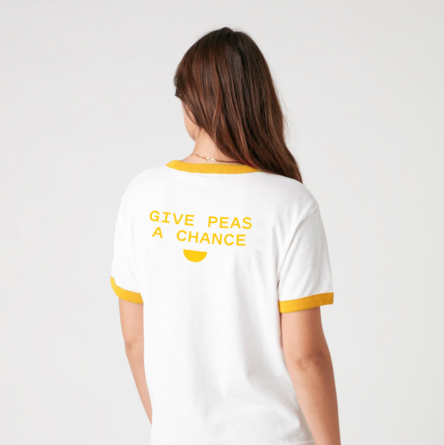
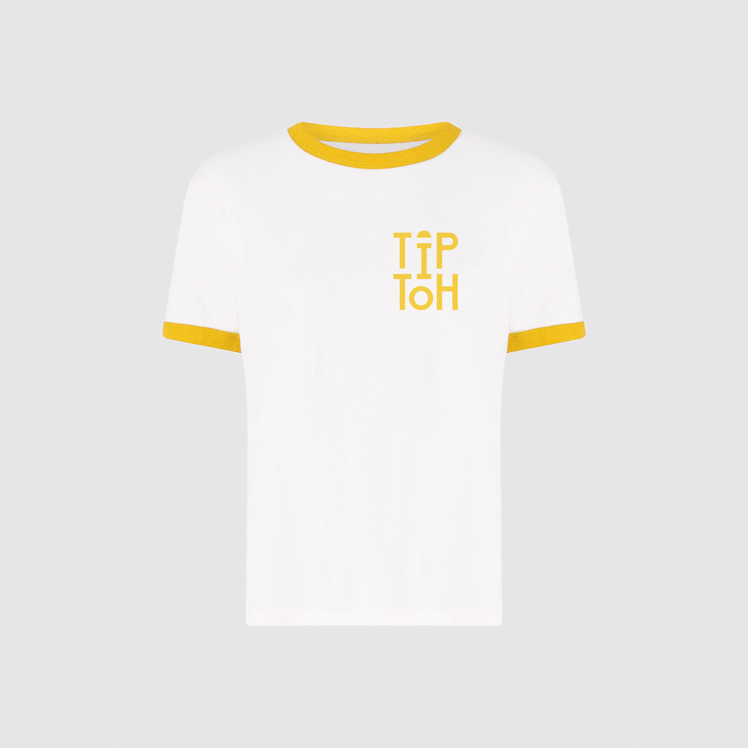
Beyond the physical packaging, I designed Tiptoh’s webshop, merchandise, motion design and store displays.


