Danspunt
2024 – 2025
brand identity
motion design
printed matter
wayfinding
Website by Statik
Motion design by Ward Rombaut
Signage by Styleman
Naming by Elvire Delanote
Photography by Rudy Carlier
Danspunt supports and inspires dance enthusiasts and professionals across Belgium. I created their new visual identity capturing the essence of dance: movement, connection, and expression.
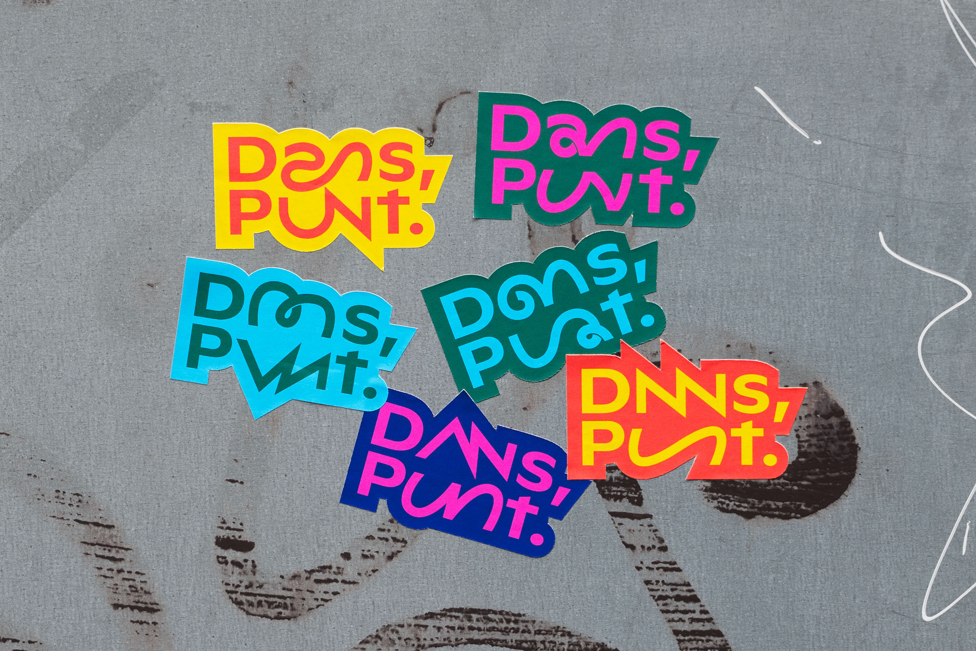
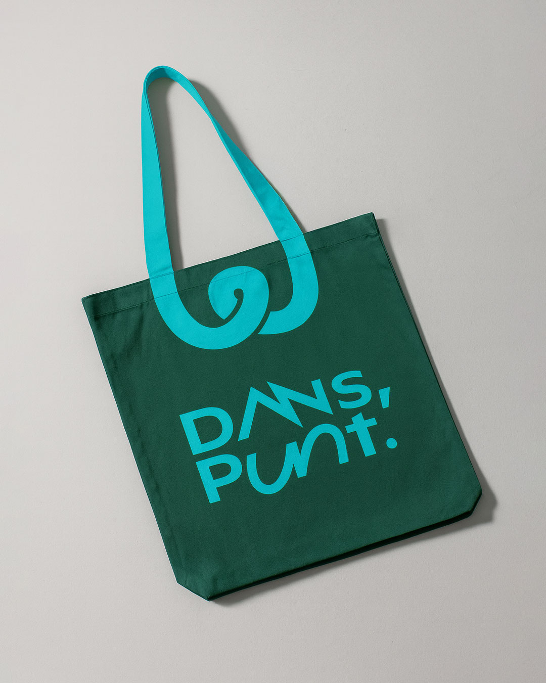
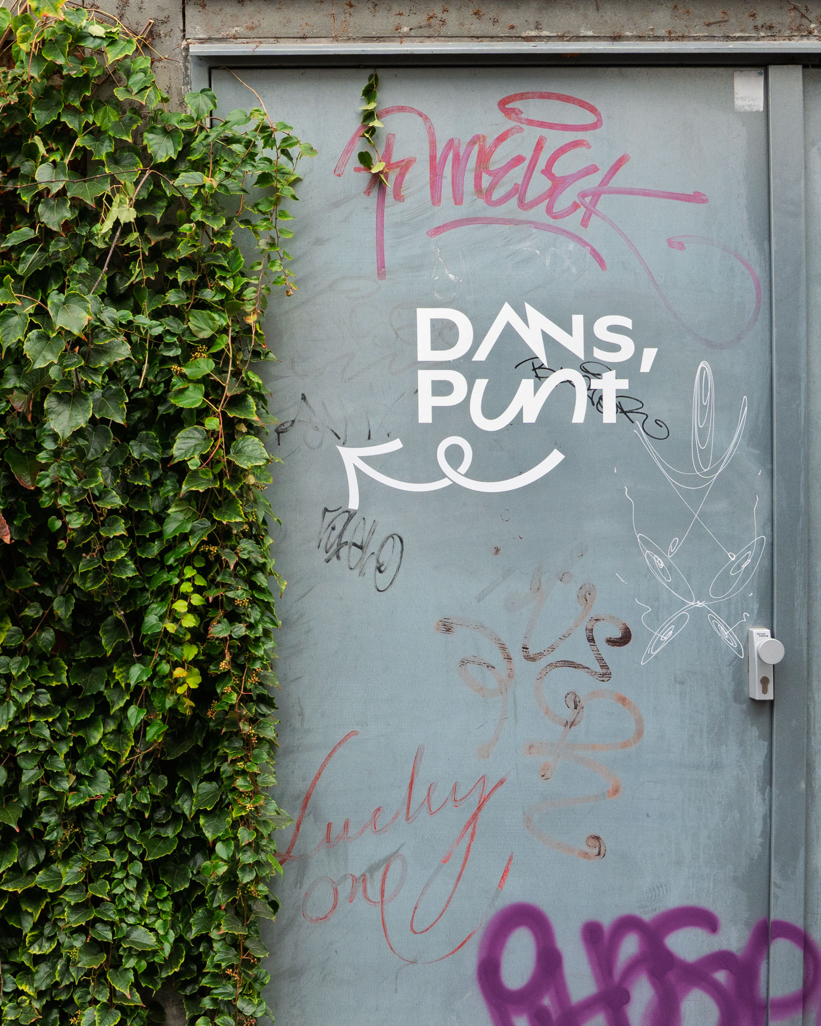
The name Danspunt received a renewed meaning with the addition of a dot and comma, Dans, Punt. to highlight its role as the home of all things dance.
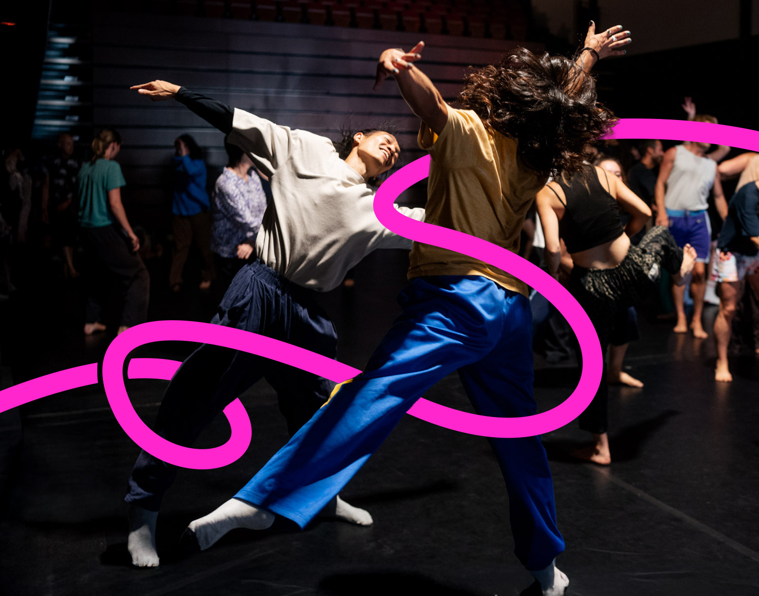
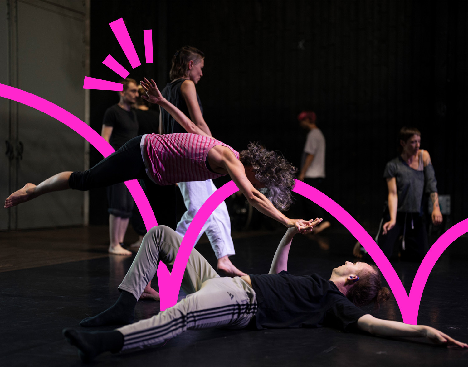
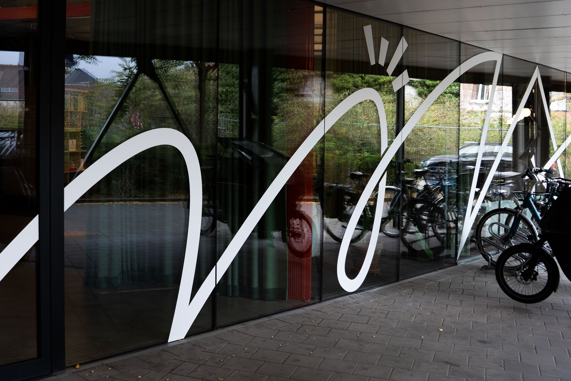
The identity revolves around six flexible logo variations that are used across different media, always in motion. The connected letterforms reflect the connection between dancers themselves, as well as between dancers and Danspunt, visualizing the broad network that unites them.
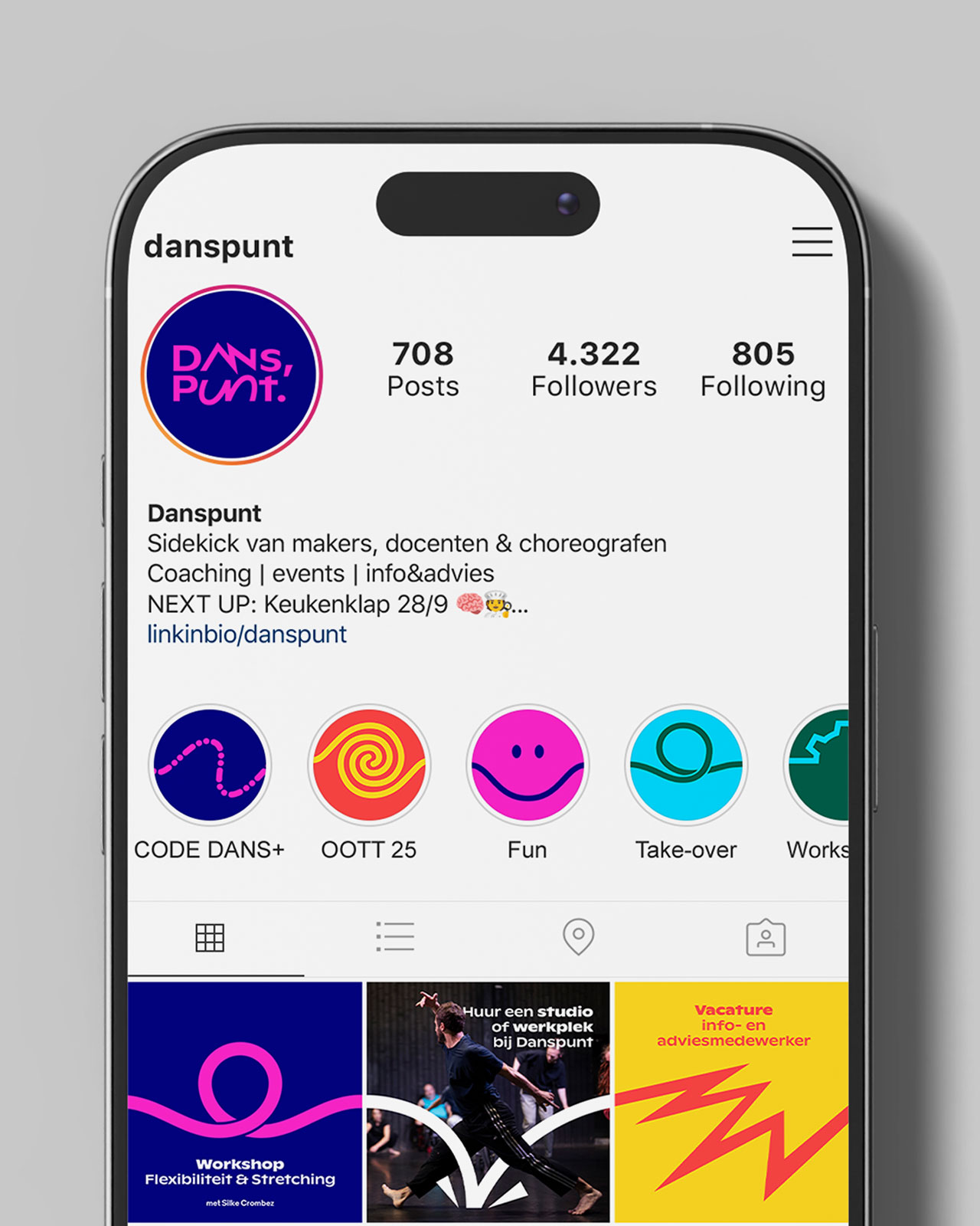
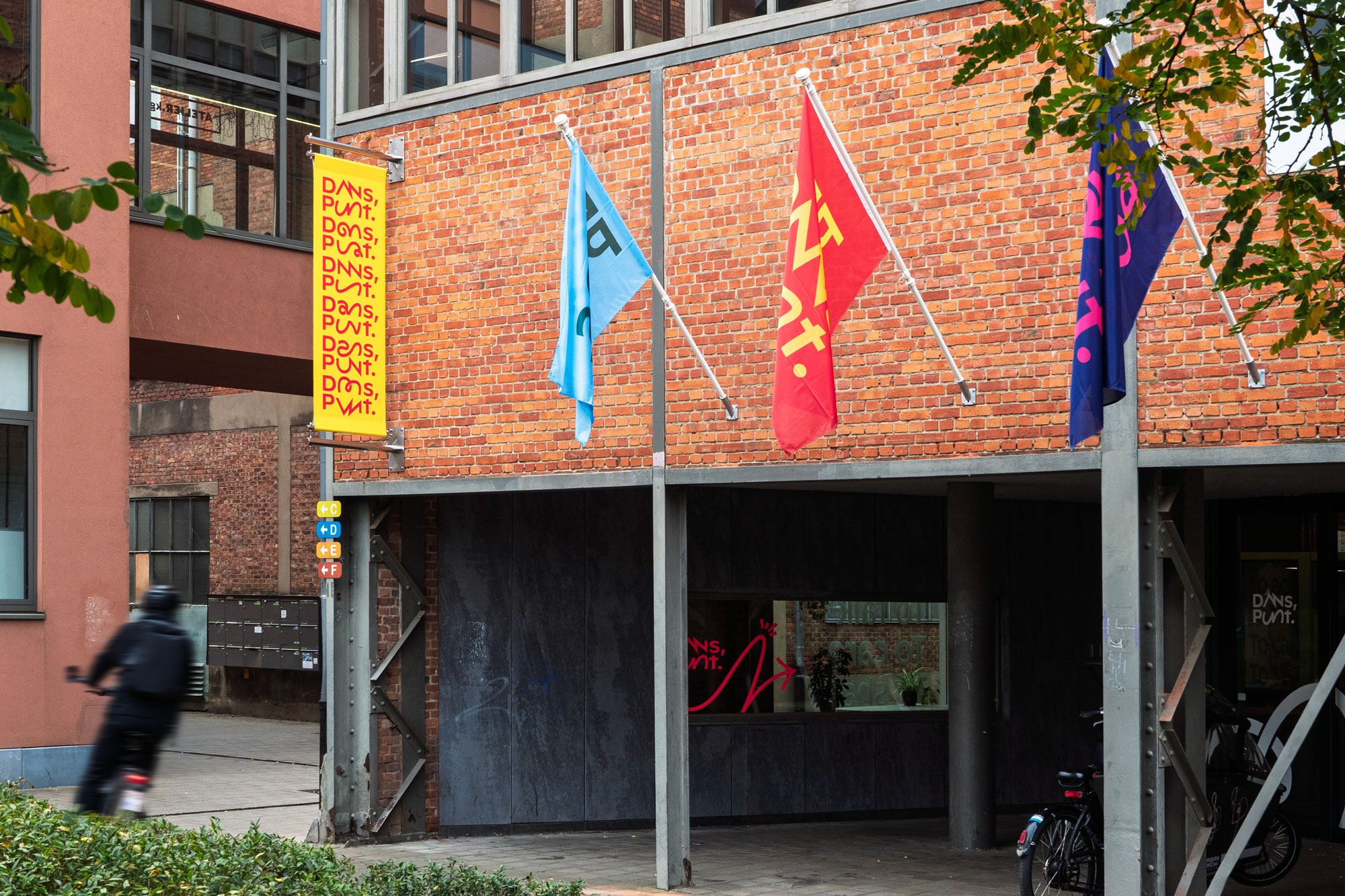
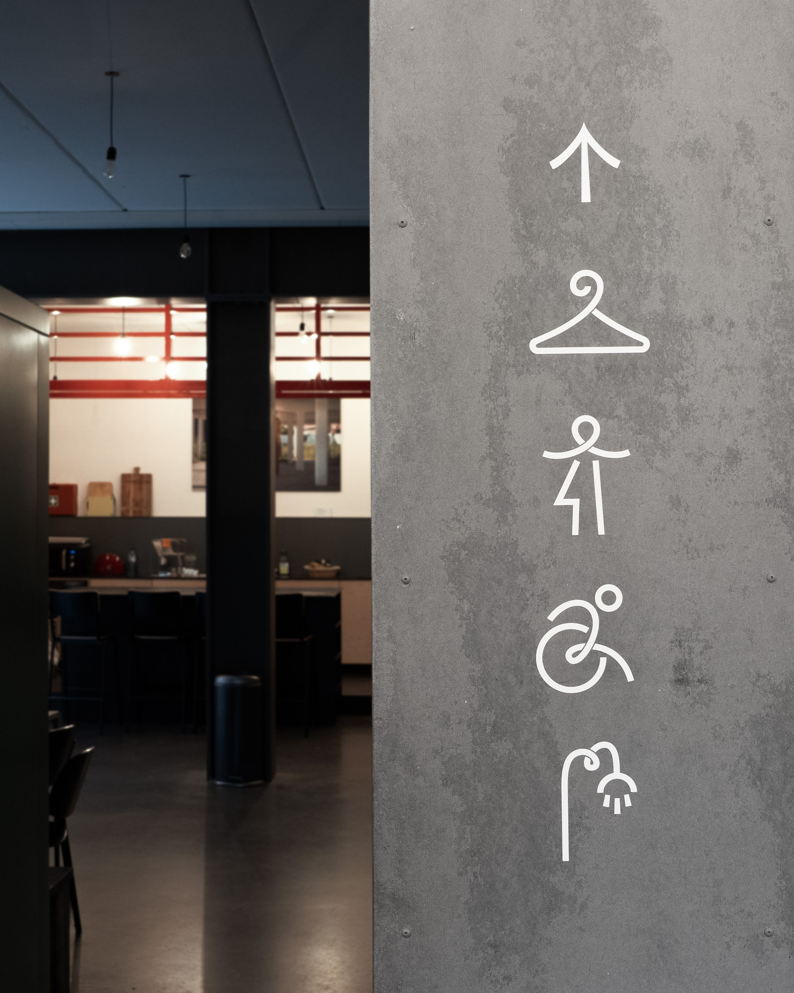
The flowing lines additionally express the many energies of dance, sometimes soft and organic, sometimes sharp and angular. This linework forms a simple and adaptable visual language that extends naturally into signage, iconography, and various applications like stationery, the website and social media. A bright, powerful color palette reinforces this bold visual identity.
Alongside digital and print designs, the identity was applied to a new façade signage system with flags, banners, and a full-window graphic that invites visitors inside. It continues throughout the interior with wayfinding elements for the studios, restrooms and foyer.